|
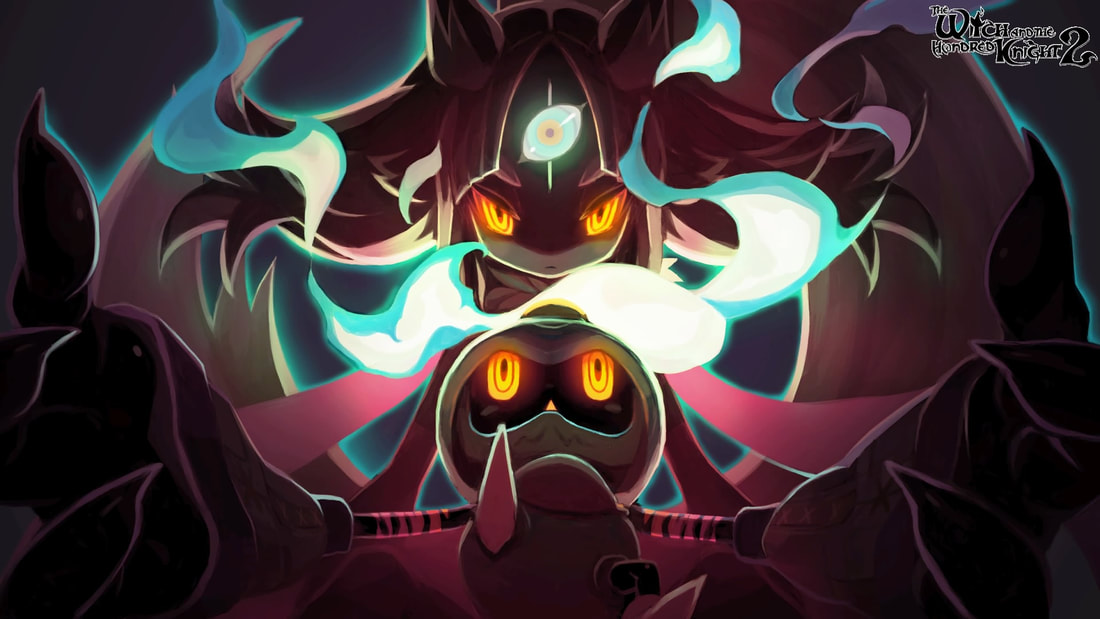
Player(s): 1 Platform(s): PlayStation 4 From the developer of one of my favorite series, known as Disgaea, comes an action RPG with story, art, and presentation. All of which you can skip. Don't know what I mean? You will have an idea soon enough. Just a little background, I have not played or even seen gameplay of the original The Witch and the Hundred Knight, but I'm here for the sequel. This is from a fresh perspective and not bridging comparisons between the two. Now, let's take a look. The game's world is set in Kevala, a place in constant fear of witches. For those infected with "witch disease," as they call it in this world, a third eye will appear on the forehead and once open they will awaken as a witch. Witches are supposed to be very destructive and unkind, leaving misery in their wake. In this game, Milm is infected, leaving Amalie to struggle for answers and figure out what to do. It's a great setup for a good story. That's what this game attempts to do, for the most part. The story to The Witch and the Hundred Knight 2 is pretty standard, someone needs help, you must kill to protect, and in this case it's love for family and then to save the world of course. Voice acting is both good and bad, noting the English voice acting. The main characters are not bad, and even rather enjoyable to hear. It's the side characters that more often than not fall short. Sooner than later you start to see the padding some games can be known for, and often annoyingly so. You will be faced with plot that goes seemingly nowhere and lead to plenty of exposition for almost no reason. Dialog can be funny, but a lot of times it feels like they want to draw emotion without the telling of a story. It feels it it should work in an anime and is held back only by the limits of text over voice. First thing that can be said about the artwork is it compliments the game so well. In fact, it was the first thing to draw me in. As far as graphics go, it's nothing special. The graphics really feel outdated as you start to notice the texture surrounding each area you explore. You can often see ambiance of fog, but does nothing to change things. You are given an options to change resolution, but it's miniscule. Colors are used well in establishing equipment, items, etc. Monsters and bosses are of simple design, often being obviously human or animal with nothing particularly feeling epic. You can fast-forward, but you might as well skip the scene entirely using the Options button. You can practically skip the whole game this way, including most *every* field encounter. You can't auto-scroll to enjoy the voiced dialog either, which would have been welcomed. Even the elevator at the first castle you can skip riding on, so there's no point in even having one. This castle is your main hub too, allowing you to purchase, sell, and "kraft," among other things. Combat is fun and engaging. You can roll to dodge, combo attacks, upgrade equipment, and set skills. You are always allowed to move the camera and attack as you want as combat feels very fluid and responsive. One problem I must mention is the padding. Some monsters felt only as if they were meant to be a sponge since every attack felt ineffective against them even as more skills unlocked and I leveled up. I will say that the more time focused on an enemy the more likely it seemed they might drop more rare items, however few and far between that was. The music is nice and you even have the option to create your own playlists at the castle. This is a nice and simple extra most games don't even think to add. I found myself actually using it because I admit to having enjoyed the music, so no complaints here. Everything also sounds like it has weight whenever you press a button or even just scroll the menus. Sound quality is really good here and works in the game's favor. Now, as for level design in this game.. It's literal copy and paste. I wish I was joking. You think one room, but then you walk into another room right next door and it's the same exact design with the same exact floor layout. This also gets very linear and stale over time. It gets very noticeable and I found myself skipping entire sections only due to map design. From the start, you feel you want to complete it, but as you progress you start to notice major flaws with simple fixes. Sometimes confusing or annoying dialog. Boring maps. Difficulty spikes out of nowhere. In general The Witch and the Hundred Knight 2 is an average to above-average game. I want to keep playing as it can be fun, but at the same time as a consumer and newcomer to the series it just doesn't merit the current price tag. I believe the potential is there, but it needs to feel more worthwhile. -JT You can learn more about The Witch and the Hundred Knight 2 here: http://nisamerica.com/games/the-witch-and-the-hundred-knight-2/ Gameplay/Story: B Art/Graphics: B+ Music/Sound: A Value: C- Overall: B- Pros: - Beautiful Artwork - Nice Music and Sound - Story isn't bad - Fluid combat Cons: - Outdated graphics - Lazy level design - Uninspired and even forgettable boss fights - Can skip most the game Disclaimer: This game was provided to us by the publisher for the purpose of this review.
0 Comments
Leave a Reply. |
Search
Contributors◆ Angie
◆ Emily ◆ J.D. ◆ Janette ◆ JT ◆ Manuel ◆ Nestor ◆ Rose ◆ Sylvia ◆ Teepu ◆ Tiffany ◆ Winfield Archives
July 2025
|
© 2014-2025 A-to-J Connections. All Rights Reserved.


 RSS Feed