|
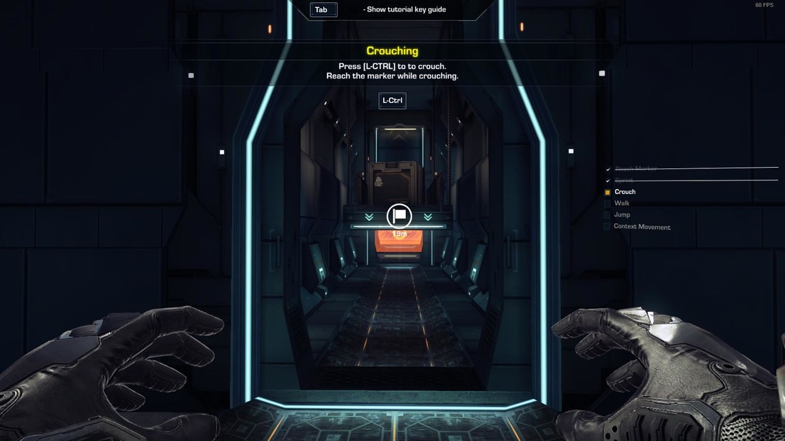
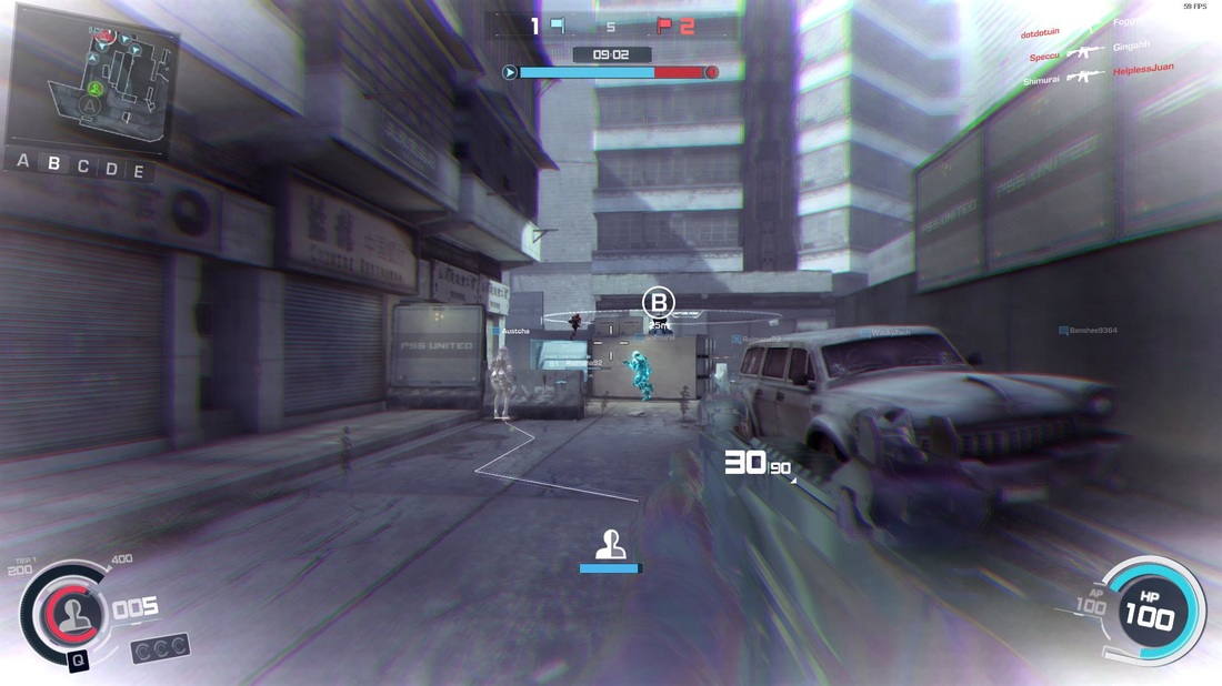
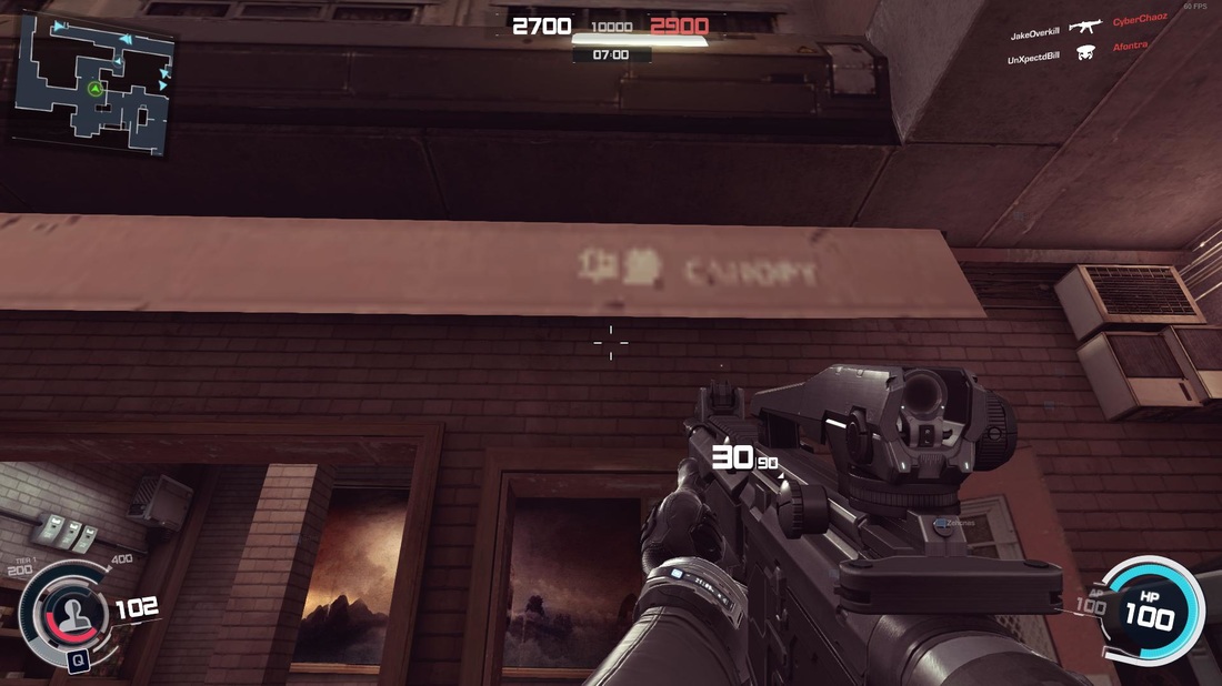
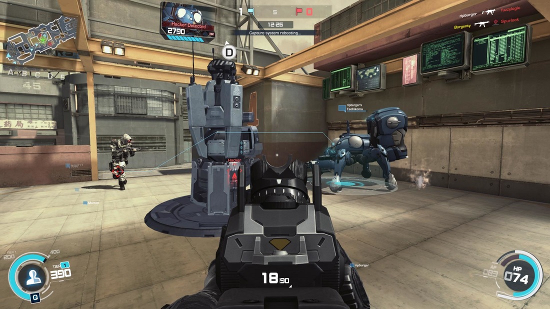
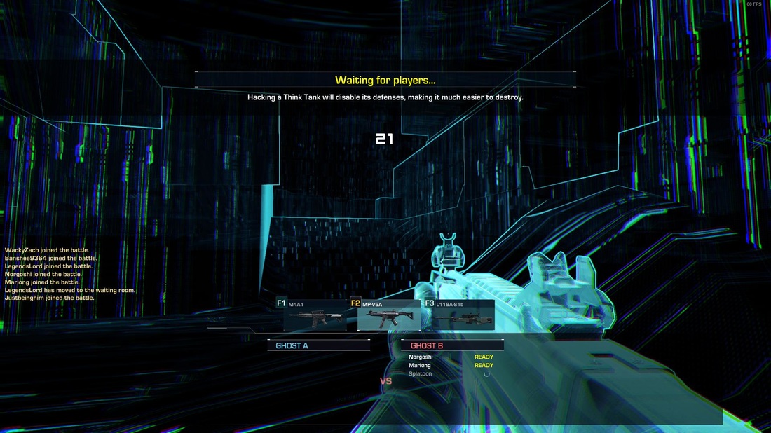
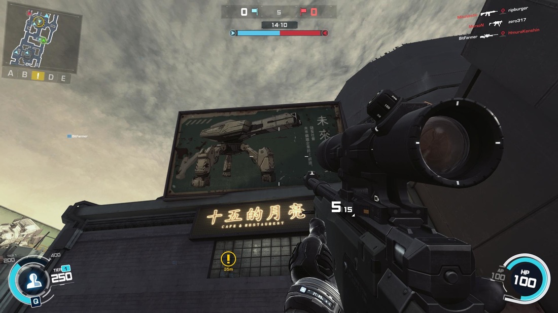
Ghost in the Shell: Stand Alone Complex - First Assault Online (yeah, that's the ACTUAL title) is an upcoming FPS by Nexon. This game has been in early access for a while, but the game is available for free this weekend on Steam. As a big Ghost in the Shell fan, I figured now would be a good time to check out this early-access title on Steam. PLEASE KEEP IN MIND: THIS GAME IS IN EARLY ACCESS BETA. THIS REVIEW DOES NOT REPRESENT THE FINAL PRODUCT, ONLY WHAT IS BEING OFFERED AT THE TIME OF WRITING. When I first launched the game, it was in some hideous resolution which I wasn't able to change. Strike one. In fact, I was forced to go through the entire tutorial before even seeing a menu. I couldn't turn on subtitles (less important for me, but I know for many people that's a big deal) during the cutscenes either. The game just assumes that everything will be optimal for you once you hit "play". I went through the tutorial in a pretty bad mood as a result of this. Graphically, the game is decent. It looks sort of like a last-gen shooter if I'm being totally honest. I actually love the look of the tutorial area, but not any of the multiplayer maps I got to play on. Once I was finally able to up the resolution and graphical fidelity, I hopped into a game and was met with, well, not much that impressed me. The premise is that you play a member of Section 9 and fight terrorists in various FPS game modes like deathmatch and conquest. You choose an operative to play, similar to something like Dirty Bomb, and can customize that operative or unlock others through playing. Each operative comes with their own unique skill which can be activated during combat. I chose Motoko, who comes with the ability to temporarily cloak herself and become almost invisible. Pretty useful. I love the concept of the individual skills, and there's a crazy mechanic where you can actually SHARE some abilities with nearby teammates. For example, Motoko can activate her cloaking, and nearly allies can choose to copy the cloaking onto themselves. That's actually pretty innovative and I have to give the developers props for that. There's a wide variety of guns in the game which you can unlock over time, as with other shooters in this vein. At first you're given three classes; one with an assault rifle, one with an SMG, and one with a sniper. Barebones in all aspects. The guns are different enough from one another but there's not a lot of originality or imagination going into the design. Ghost in the Shell is set in a cyberpunk future, I'd love to see some more variety and depth. And speaking of the cyberpunk future, well... The look of this game is fairly disjointed. You're playing as these high-tech augmented supersoldiers in what look like threadbare modern locations ripped straight out of Counter-Strike or Call of Duty. The character design is lovely, but of course no work was required in taking characters from a well-loved franchise and shoving them into this game. One thing I do like is the presence of think-tanks (Tachikomas if they're on your team) which can be brought out by a team, but they're so overpowered that the fights become laughably one-sided until it gets destroyed. There definitely needs to be some balance in that regard. The gunplay itself is actually fairly decent. Getting a kill feels satisfying, and there's reasonable bullet feedback. There IS a little too much screen shake when you fire, which can make it a headache to fire automatic weapons for more than a short burst. Dying doesn't feel too bad, since every time I felt like it was my own mistake rather than some kind of RNG bullshit you might find in a game like Battlefront. It runs smoothly. I see a lot of complaints about hit detection, and maybe it was just my luck, but I never saw many of those issues. The biggest problem with the gunplay is that it's just pretty lackluster. It's smooth but empty. There's no real depth to this game at all. This game is full of issues, to be perfectly honest. It lacks a lot of depth. I love the Ghost in the Shell franchise, and it hurts to see its image being thrown through the mud these days. This game needs A LOT of work. It feels lazy, but I can tell by the minute details in the level design that at least SOMEBODY is trying hard. I'm sure the developers want to improve this game further, and I sincerely hope that they do. I do not recommend this game in its current state, and I won't be playing it again without some SERIOUS mechanical and graphical overhaul. It's empty. It's a dull entry in an already over-saturated genre. This is unfortunate because I think there's actually some real potential here. If the developers read this, I really don't mean to sound harsh. I want to see hard work get rewarded, and I'm getting a feeling here that this WASN'T just some kind of cash-grab like some other reviewers believe. Unfortunately, First Assault Online needs some serious work or it will never make it off the ground come launch day. -Justin PROS
CONS
0 Comments
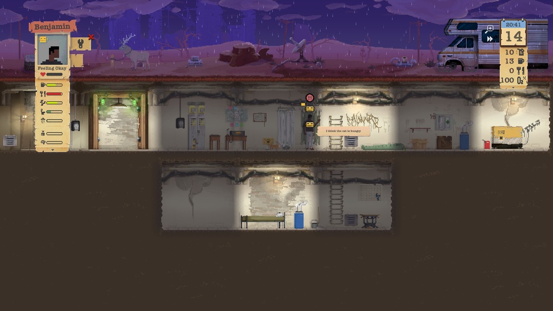
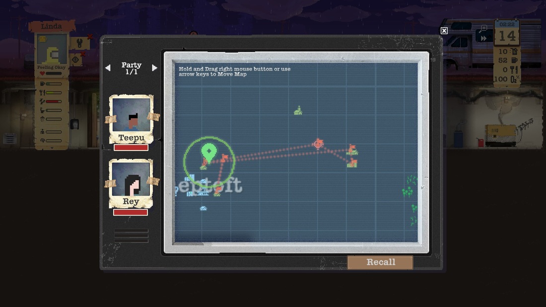
Platforms: Windows and Mac (via Steam), Xbox One and PlayStation 4 Player(s): 1 If you’ve played mobile games like Fallout Shelter or Tiny Death Star, you might already have an idea for what to expect from Sheltered. Sheltered is a game that revolves around you helping your family of four survive in a post-apocalyptic world. You are in a simple shelter where you need to build, organize and manage various elements in order to assure survival. You start off by creating your family of four. You can choose what they look like (the options are admittedly a bit limited), give them names and also choose their personalities and traits. Their personalities and traits determine what kinds of skills, abilities and stats they will adopt, all of which will be displayed for you to see before you make your final decision. You are then thrown into your shelter with a very short and very basic tutorial. The game depends more on you discovering how to do things on your own, with the tutorial only giving you the basics of what you need to know to get started. With my increased complaining about the amount of hand-holding that takes place in video games these days, I found this to be particularly refreshing. Your shelter is split into rooms. Within each room, you can place objects such as beds, toilets or crates. This means that you are left with limited space. To make things interesting, you have resources which are in constant need of replenishment: water, oxygen, food and power. The main source of water is rain. You have a filter on the surface that filters the water into your base, where you will need retainers (which take up space) to store the water. Oxygen is provided via an oxygen filter on the surface, and doesn’t require much maintenance on your part. Food can be acquired via hunting, trapping, growing plants or scavenging. This, of course, requires a way of storage as well (pantry for rations and freezer for meat). Power is produced via a generator. The amount of power you use up per unit of time is proportional to the amount of items you have which draw power. For example, if you have a lot of freezers and lights in your shelter then you can expect to be using a lot of power per unit of time. The generator requires fuel (in the form of what looks like gasoline) to run. In order to help manage and run your shelter, you are provided with a work bench where you can build everything you need. The items you can build are split into 4 tiers, with increasingly efficient and useful items as you increase your building tier which requires upgrading your work bench. In fact, you can also upgrade your generator, oxygen filter and water filter multiple times to increase efficiency and durability. The majority of things in your shelter wear out with use, and will require you assign your shelter members to repair them. This is a simple process, but it requires that you pay attention to what’s going on in order to assure you don’t let anything break down. You can also upgrade your shelter doors, making them stronger in the event of an outside assault. Building things from your work bench requires various materials, which you acquire from either trading or going on expeditions to scavenge for parts. You can send up to two people at a time on an expedition (though you can set up multiple expeditions). You can equip various items to increase survivability or efficiency. A map is then pulled up, where you can plot your course via waypoints. Buildings and landmarks will be marked as you discover them. The distance you can venture is determined by how much water you have. Water is essentially your fuel. It’s important to note that this water is pulled straight from your water supply back at base, so don’t learn the hard way (like I did) that you could leave your people at home with no water. I really liked this mechanic because it was simple but helped to drive home the idea that your resources are finite. Your pair will then travel on their own, communicating with you via the radio. This is where things got particularly interesting to me. As they venture out, they can search buildings for loot, loot which will contain valuable building and upgrade materials as well as special items. There are three types of special items: RV parts, tools and blueprints. If you gather all the RV parts, you can use your RV to venture out, using fuel to offset the water use, travelling further than normal at a faster and safer rate and also providing significantly higher storage. The tools you find will be added to your workbench in order to increase repair and building efficiency. Finally, the blueprints will give you the ability to build special (generally overpowered) items such as beds that cure illnesses or ultimate weapons. While you’re out and about, you can also have random encounters with animals or people. If you run into an animal, you can choose to fight it (via a turn-based combat system) or run. The combat system is rather simplistic, revolving around dealing damage, defending, running or subduing the enemy (you can only subdue other people). That being said, it does offer enough engagement to keep the player interested. If you fight and win, you can harvest the meat and usually some leather as well. The more interesting bits are when you run into people. You can usually choose to trade, bully, fight or recruit these people. Sometimes you’ll run into marauders or belligerent people who’ll force you into combat, where you can try to flee or try to fight them. The trick is that if your team member dies, they’re dead. That’s it. So it’s important to think about survival over bravery when approaching these situations. Over time, other survivors will begin to create hostile factions who you’ll either have to take down or avoid altogether. Speaking of survival, we come to my second favorite thing about the game (the first being the expeditions). Your shelter members can be afflicted with various conditions, which require your attention. Some of them are basic, like hunger or lack of cleanliness. These basic needs you can automate, so you don’t need to constantly micromanage menial tasks. The real trick is in illness like radiation poisoning, food poisoning or bleeding. For these you require having medicines. Besides food poisoning, most illnesses will almost always result in death. This was especially fun when I ended up losing two of my original shelter members because I sent them out without gas masks and realized I didn’t have any anti-radiation medicine at base when they came back. When your team members die, this event also traumatize your other members. A shelter member death usually results in a few consequences, which allow you to deal with it as you see fit. Amidst all this, you can speed up time to help do things faster and easier. It’s interesting because you realize after an hour or two that the game is extremely repetitive and has a Sims-like menial quality to it. In a similar fashion, it also has an odd Sims-like addiction to it. Even though you’ll find that you’re mostly doing the same thing over and over, slowly working toward some simple goal (an oxygen filter upgrade, or a new bed, etc.), you’ll likely find yourself playing for a long time. I ended up surviving my single save file for a total of 269 in-game days and ended up playing for almost 20 hours before coming to write this review. Considering my general dislike of the play-styles of mobile games, I was surprised by how much I enjoyed this game (which follows a clear mobile play-style, minus the micro transactions). The game looks cute and excels at presenting itself in a simple 8/16-bit style which really gives it a grounded feeling. For anybody who enjoys strategy, survival or managing units, I highly recommend you give this game a chance. If they could make a believer out of me, they can likely make a believer out of you too. - Teepu Gameplay: AMAZING Graphics: AMAZING Sound: GREAT Value: AMAZING OVERALL: AMAZING Screenshot GalleryFULL DISCLOSURE: This game was provided to A-To-J Connections free-of-charge by the developers in order to write this review.
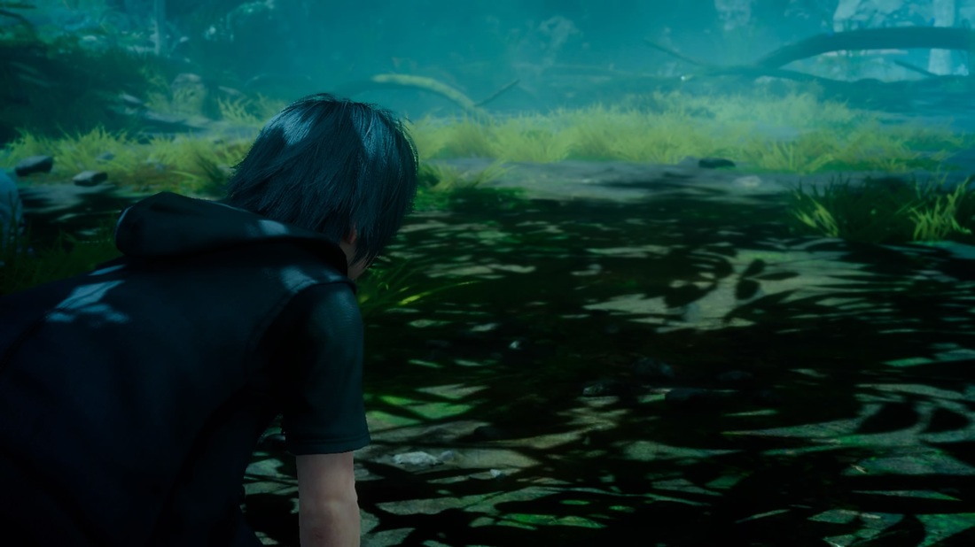
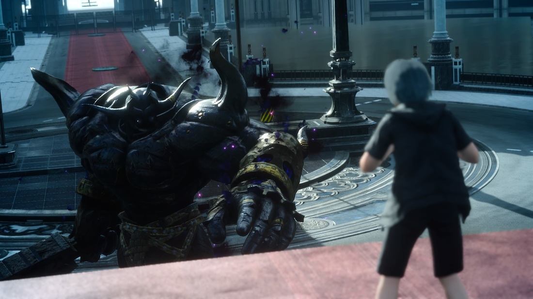
Platforms: Xbox One, PlayStation 4 Player(s): 1 Amidst the plethora of amazing announcements surrounding the Final Fantasy XV Universe lately, there may have been one that slipped by: the demo. As is becoming a relative trend with Square-Enix lately, the new demo for Final Fantasy XV is actually an independent story from the main game. This was also done with Bravely Default and Bravely Second (both on the 3DS). This story follows the story of a young Noctis (the protagonist of the main game) as he falls into a dream. There isn’t much substance to the story, as it’s there to fuel the progression and to give context to the events, nothing more. Noctis seems to be trapped within the dream, and must follow the guidance of his friend the carbuncle in order to try and escape from the dream. Based on this, you traverse through four different landscapes as you work towards you eventual escape. The first, focuses on easing you into the navigation and combat. Nothing is pushed on you, and you are able to get a good feel for how to progress through this. The second focuses mostly on exploration, throwing you into an open area with some minor resistance along the way. From here, you can progress straight to the objective point or just enjoy checking everything out. The next section involves a city scape, which focuses more on combat with exploration being on the side. Here, you get to try out some new toys. In the final area, you get a little surprise along with an exciting boss battle. This battle helps to give an example of how to use one of the more advanced abilities: warping. You’ll find that the combat plays similar to Kingdom Hearts, in that it’s action rather than turn-based. As you play the demo, you can collect crystals, which allow you to unlock functionality from various plates that are strewn about the environment. Many of the plates are merely there to help show off the various effects of the game engine (such as changing weather or changing the time of day on the fly). There also weapon unlocks (toys) and a few transformations. Upon completion of the demo, you are given the opportunity to name the carbuncle. The carbuncle will then transfer to the final game when it releases, though to what end we do not currently know. Though the demo is only about 30-60 minutes long, it does a really fantastic job of giving you an idea of what to expect from a gameplay and an aesthetic standpoint. Even though it may not be as refined as a full game (it IS a demo after all), it succeeds in its task: enticing the player and piquing interest. Platinum Demo is available for download on Xbox One and PlayStation 4. Final Fantasy X was the last time I was truly excited for a new Final Fantasy game. Final Fantasy XV has helped to change that immensely. I couldn’t be more excited. Stay tuned for more information involving the Final Fantasy XV Universe. Platinum Demo is available for download on Xbox One and PlayStation 4. Final Fantasy XV is set to release on September 30, 2016 on both consoles. - Teepu Screenshot GalleryNOTE: All thoughts and screenshots are gathered from playing the PlayStation 4 version.
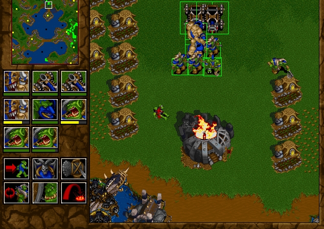
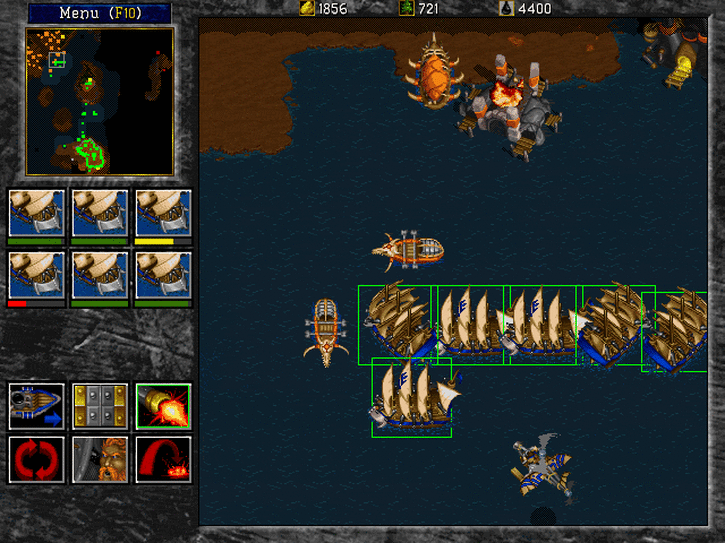
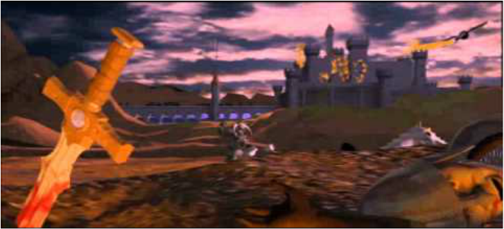
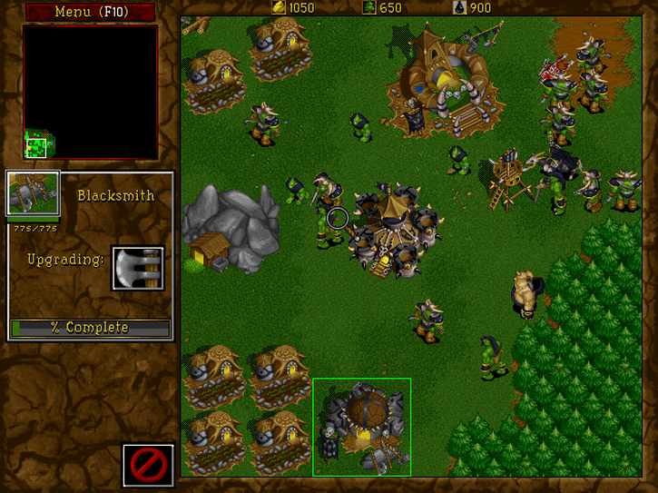
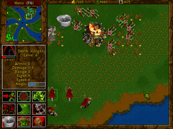
Official Final Fantasy XV Site: http://www.finalfantasyxv.com/ Official Square-Enix Site: http://na.square-enix.com/us/hom Platforms: MS-DOS, Mac OS, Windows, Sega Saturn, Sony PlayStation Players: 1-8 Blizzard took everything that was flawed in Orcs & Humans, threw it away and put together this game that is so much better. To begin with, the game looks great. Though there are a handful of environments they all look quite unique. The animations are fairly fluid and each unit looks fantastic. Watching two armies clash in this game was absolute bliss in its prime. The cut scenes also look fantastic for its time, but are slightly flawed with awkward models and content that generally has absolutely nothing to do with the current story. The sound, on the other hand, is flawless. The music is very appropriate and sounds fantastic (you will not forget these tunes). What impressed me the most is how the music actually adds character to each of the two factions. The sound effects of each unit are amusing, well-acted and generally appropriate. As far as the sound goes, I have absolutely nothing to complain about. Now the controls are a major improvement over its predecessor. You can now click and drag to select multiple units! The maximum units for a group is now 9. To make it even better, you can program a group to a number on the keyboard (0-9) to make a maximum of 10 groups of 9. That means you can effectively control 90 units at a time. Also, right-click is now used for movement/attacking and left clicking is used for selecting. This is all very familiar to us in modern gaming, but was relatively new back then. The controls are much more optimized and the only complaint I have is that using spells can be a little difficult in the heat of battle since you have to individually select your unit to use the spell. Still, this is a major improvement over the original and the game is actually playable this time around. There are two factions: the Orcs and the Humans. Each factions tells the story through its own unique perspective, and the story starts to get quite a bit deeper in comparison to the original. Each factions is nearly identical though when it comes to gameplay, with minor differences in some spells only. This means that you are choosing to play as whichever faction you like better through aesthetics mostly. Still, since the game is balanced, you will find every match to be a match of fast-paced and violent chess. The best thing I like is that roads have now been removed, giving you much more freedom in building. Most interestingly though, is the new naval aspect that makes things a bit more dynamic. The campaign for each faction is easy and gentle for the first 7 missions. Then the last 7 missions put you into absolutely difficult situations that require you use of all the tactics you have learned. Sometimes it can be brutally difficult. Through some creative thinking, everything is still manageable. I was a little disappointed that the cave missions were removed in this game (where you are given a certain number of units and you must get through an enemy-filled dungeon and survive), but I suppose Blizzard used that opportunity to make a whole game based around that concept: Diablo. There are a total of 28 missions, 14 being extremely difficult and 14 being fairly easy. The sudden change in difficulty can be a little jarring and frustrating at first but a little practice will ease that frustration reasonably quickly. One of the best things about this game is the multiplayer. You will find that you will be playing this game long after you have completed the content if not for the multiplayer, then at least for the skirmishes and the unique scenarios that the game includes. That’s not all though! This collection also includes the expansion as well. The expansion adds a couple new environs that look really cool to help keep things a little fresh. Some of the new heroes also looks pretty neat. In the single player campaign, there is a lot added compared to the bae game, as far as story goes. The story is a direct continuation and actually adds quite a bit of interesting information into the lore (very important information that is important to the series as a whole). The campaign has its own varied missions, which are appropriately challenging. To top it off, there are a ton of cool new maps for multiplayer. Unfortunately though, since the game doesn't add any new units or any interesting upgrades to the mix, the same strategies still hold true. This means there are no new dynamics and so the gameplay in multiplayer essentially remains the same. There’s even a level editor, to help create a longer lasting experience. Despite some of its flaws, it is an overall solid expansion that helps to round out the package quite nicely. Warcraft II is a classic game that defines a lot of what we see in real-time strategy games now. This is a good package that puts together everything from Warcraft II and its expansion along with the later added Battle.net functionality into one nice package (read: online play). This is one of the best RTS games even to this day. Granted, so many newer games offer so much better content and optimization, but for its time and what this offers, you can't find much better in the genre. - Teepu Graphics: GREAT
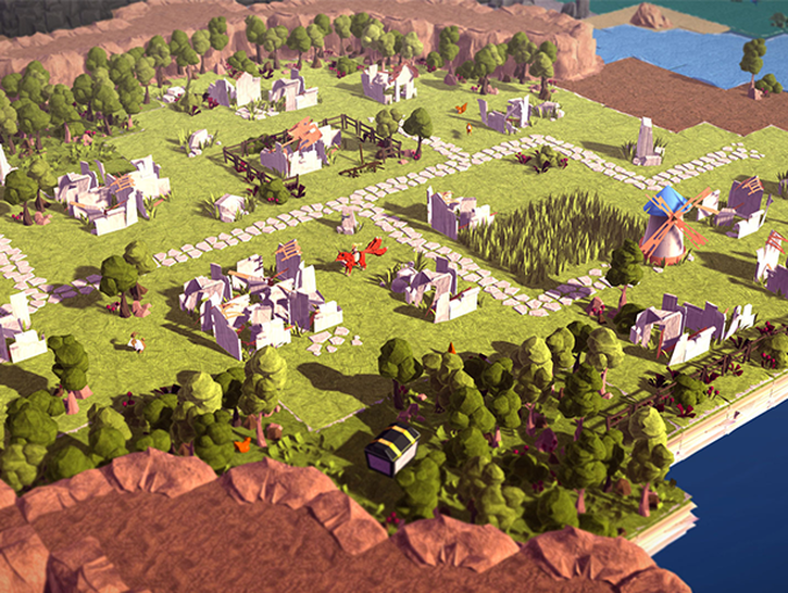
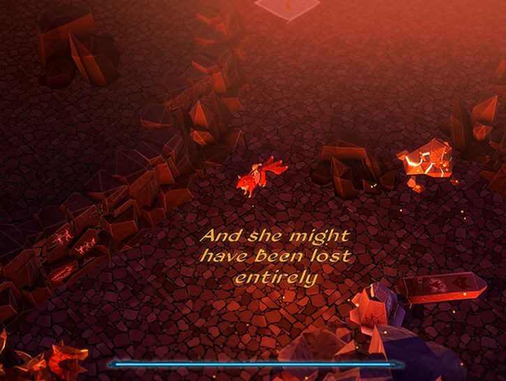
Sound: GREAT Gameplay: AMAZING Value: PERFECT OVERALL: AMAZING NOTE: Sega Saturn and Sony PlayStation versions do not include online functionality. Every once in a while, a game comes along with a beautiful art style which draws potential players in before they even know what the game is about. This is Epistory - Typing Chronicles, the latest from Belgium-based developer Fishing Cactus. Before I even read the full title, all I knew about this game was that it was gorgeous. Besides being incredibly good-looking, Epistory is a story-driven typing game in which the player controls a girl riding a fox through a fantasy landscape. In order to do anything within the game, the player must type words of varying length and complexity. This can be anything from simply clearing a path, to typing "resume" in the pause menu, and even combat. Being a story-driven game, there's a lot about Epistory I don't want to reveal. I'll avoid spoilers and talk only about 1) gameplay mechanics, and 2) the first ~20 minutes of the game. This is a game which should be experienced firsthand and I don't want to take any of that experience away from potential players. At the beginning, the player is put in control of the girl on the fox. You walk around the world and learn the basic concept; a tree blocking your path? Type the word floating above that tree to watch it disappear before your eyes. Trying to gather experience? Look for words all around the landscape, revealing dialogue and backdrop items alike. You might plant a few flowers, or expose a larger area to walk around in. Things start to pick up when a meteorite crashes into the land ahead. Upon exploring, you find a deep cave full of dangerous creatures and rivers of lava. You pick up the power of flames, giving you the ability to burn bushes and enemies alike. I'm not telling you anything else because, again, you should experience the story for yourself! While walking around and typing obstacles out of existence seems a bit casual, combat is where the game can get frantic. If an enemy so much as touches you, that's game over. In true storytelling fashion, you're met with a "no, that's not how that happened at all" à la Prince of Persia. In order to defeat the creepy beasts, you have to type the words which keep appearing over their heads while they approach. Faster typing means faster killing. If you're a bit too slow? Well, you better hope that you're not. From what I've heard, the game actually adapts to your typing speed. That means that if you're the kind of person who types one letter at a time, that doesn't have to be a barrier to entry. I haven't seen this because I'm a filthy millennial who grew up at a computer. Oops. Apart from story and gameplay, there are a few other aspects which push this from "game" to "work of art". The art style, as mentioned, is beautiful. The world is made up of pages out of a book, and every item and creature is like a little origami creation. The voiceover for the narration is superb, the soundtrack is pretty... Honestly, this game is a really solid package all around. This is a pretty short review because most of the game is story-driven, but I highly recommend you pick it up if you have the means. -Justin Graphics: PERFECT Sound: GREAT Gameplay: AMAZING Value: GREAT OVERALL: AMAZING Fishing Cactus: Website: http://fishingcactus.com/ Facebook: https://www.facebook.com/fishingcactus?fref=ts Twitter: https://twitter.com/FishingCactus FULL DISCLOSURE: this game was provided to A-To-J Connections free-of-charge by the developers in order to write this review.
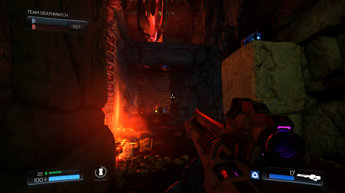
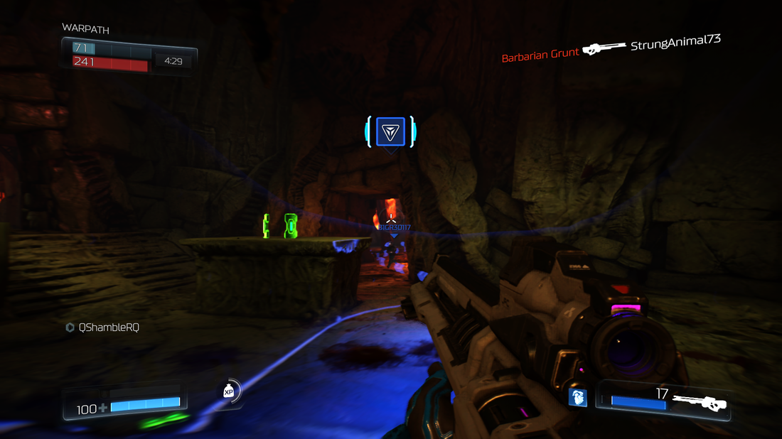
I was lucky enough to be a part of the Doom Alpha, and now I got to try some of the game via the Closed Beta. I’ve been completely excited for the game since it’s been announced. As I see more of it I want it more. That being said, the beta left me satisfied and dissatisfied as well. Fair warning, my impressions are solely based on the experience on the Xbox One. The first thing I did when I booted up the game was go to the customization screen. I always love customizing my character. While there were practically no armor options (I later started unlocking more through gameplay), I did like the types of customization. It’s similar to Halo, where you can choose a primary and secondary color for your armor, but you can also determine how worn it looks, which is a nice touch. To top it off, rather than giving specialized skins, you are given patterns to play with for the weapons, which you can apply and customize as you see fit. There isn’t a lot of flexibility, but the amount of flexibility that’s there is certainly welcome. After that, I jumped into the game, selecting random between the game types (Deathmatch and Warpath). I jumped right into the map called ‘Infernal’. This map wasn’t in the Alpha, so I looked forward to trying it. The design reminded me of Doom 3’s rendition of Hell, which pleased me greatly. There is a lot of detail in the map, down to the way the models are designed and the effects (such as glowing pentagrams or flowing lava). This all made the map feel like it was pulled straight out of the campaign, which is pretty cool. The actual mechanics of the maps are very familiar. There are teleporters, jump pads, pits of doom, narrow passageways, wide open areas and some environmental hazards. Strewn all over the place are ammo pickups, armor pickups, and the occasional power-up or power weapon. One of my biggest issues with the gameplay was the lack of weapon pickups. Have weapons placed around the map is a staple of the arena-style games this borrows from, yet it’s not present. Doom, instead, adopts the loadout system that most modern shooters use now. This means that you are given two weapons and an accessory to start with every spawn. Besides the rare power weapon (or demon transformation), there is no way to acquire weapons as you are playing unless you are killed. I felt like this took away from the fast-paced frantic style that makes these types of game the most fun. If they had done a loadout system with some basic weapons, but still had other weapons around the map it’d be more interesting. Unfortunately, this is not the case. Coupled with that is a ‘hack’ system where you get hacks that you can use to give you certain edges during the match (essentially the same thing as Titanfall’s Burn Cards). This feature I actually liked a lot. I never felt like any of the hacks that were presented gave me enough of an advantage to make it unfair. It’s just little things, like seeing the location of the person who killed you, or seeing where a power-up will spawn. While we’re on the topic of weapons and hacks, I’ll mention that the weapons (mostly) feel like underpowered baby toys. In the end, the only weapons I found myself (and others) using were the rocket launcher and the sniper rifle. Some of the weapons have interesting secondary functions. The rocket launcher, for example, allows you to detonate a shot rocket at any point before impact. This allows for much more tactical use of the weapon, and also helps to devalue the other weapons even more. The shooting in the game feels very much like the arena shooters we’re used to (Unreal and Quake). Everything is fast-paced, responsive and high-intensity. To shake things up a bit, there is a demon mechanic (similar to the Big Daddy mechanic in Bioshock 2). A rune will appear and whoever picks it up will transform into a demon of their choice (only the Revenant was available in the Beta). This player gets extra powers. In the case of the Revenant, we have the ability to powerful rockets from our shoulders, use a jetpack to hover and fly a little and also use a powerful slash attack. Whenever a demon is summoned things get pretty interesting, and I really enjoy the type of dynamic this brings to the firefights. Being an arena shooter, mobility is extremely important. The aforementioned jump pads and teleporters are great, but we are given more vertical mobility via a double jump as well. Overall I really liked the mobility and pacing of the matches. I also really enjoyed the new mode called ‘Warpath’. This is basically King of the Hill, but the ‘Hill’ is a constantly moving zone which you have to hold. This makes things extremely dynamic and forces players to be on their toes, rather than learning how to hole up in certain locations like a turtle. Putting gameplay aside for a moment, the game certainly didn’t look perfect. There was constant texture loading, low resolution effects and some rubber-banding. I rarely saw anybody with a solid connection, so I’m going to assume this was a server-side issue. Also, having damage indicators appear on screen whenever you shoot an enemy is extremely distracting and adds too much clutter to what’s an already hectic shooter. The actual design of the weapons, maps and models is great, but it doesn’t look to be that high quality. I don’t know if this is due to the limitations of the Xbox One (compared to the PC, which I’m used to playing my games on) or if it is merely a way of toning down the beta for easier testing purposes. Overall, I’m still interested in Doom, but the beta left me wondering about why they made certain design choices for the multiplayer. I’ll likely still get the game, because I’ve enjoyed every Doom campaign that has released thus far, but this multiplayer looks a bit too confused to give me the kind of fix that I got from games like Quake and Unreal Tournament. Still, this was only a tiny sample of the full multiplayer (and only a fraction of the full game). I hope they’ll use this opportunity to improve based on feedback from this beta experience. Doom is slated for release on the Xbox One, PlayStation 4 and on Microsoft Windows on May 13, 2016. - Teepu Screenshot Gallery |
Search
Contributors◆ Angie
◆ Emily ◆ J.D. ◆ Janette ◆ JT ◆ Manuel ◆ Nestor ◆ Rose ◆ Sylvia ◆ Teepu ◆ Tiffany ◆ Winfield Archives
April 2025
|
© 2014-2025 A-to-J Connections. All Rights Reserved.




 RSS Feed