|
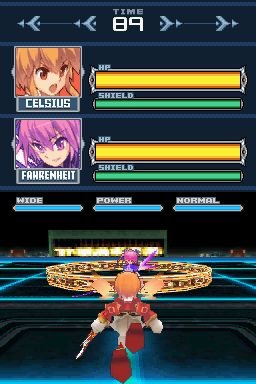
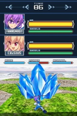
Platforms: DSi (via DSiWare), 3DS (via eShop) Players: 1-2 Clash of Elementalists is an interesting arena battle game where you select a fighter from four characters, each representing an elemental power. Released for the DSi via the DSiWare digital platform, we naturally expect it to be smaller scale than the average full retail game. That being said, Clash of Elementalists falls short in many ways even for a DSiWare game. The game has good character design and actually looks pretty good for a 3D DSiWare game, but unfortunately it lacks any real arena variety with the arenas being generic square battlegrounds. Still, overall it looks decent, which is probably the only thing I can confidently praise about this game. Let’s begin with the controls. You use the D-pad to strafe and to move forward and backward. The R button does one type of attack, the L button does another while pressing both in tandem does a special third attack. You can use the X button to jump and the B button to fall quickly. The Y button is used to dash and finally the A button is used to turn. The problem stems from the fact that there is no way to effectively follow the enemy. Since the D-pad only allows for strafing, there is no intuitive way to move and turn at the same time. Every time you want to turn you have to stop moving, hold the A button and then turn. To make matters worse, you only turn in 45 degree increments with a slight pause every time you turn, meaning it’s really slow and clunky to turn your character. To try and help alleviate this, the character automatically shifts her view to the enemy every time you jump. This would work great, except that all the enemy needs to do is dash to the side and you immediately lose sight. This makes the controls extremely frustrating and mostly unserviceable. To make matters worse, the camera can oftentimes be wonky, not positioning in logical places when moving around and almost always making things more difficult to see. With the way the buttons are used, it’s understandable that control would be difficult to implement. The real problem is that they didn’t even think to utilize the touch screen to help create a better balance or perhaps include a lock-on feature. In fact, the touch screen isn’t used at all. We’re not done yet though! To help complement the wonderfully atrocious controls comes an extremely barebones selection of gameplay options. The first mode is an arcade mode, which ends in an extremely vague text ending for your selected character. The problem with this is that there is no established story or lore elsewhere in the game, so it just comes off as being confusing to the player since it feels like the developers actually had an interesting story in mind, but never actually invested in it in any way. What’s worse is that with only 4 characters to select from, the Arcade mode is over within a few minutes. There’s a Free Battle mode where you can just fight against whoever you want in a single battle and a Training mode where you can practice your moves against an AI allowing you to dictate how they act. Finally, there is a Versus mode where you can play with another player locally. It’s too bad that there is such a distinct lack of features and such a terrible control scheme, because at the core the game actually had a lot of potential to be extremely enjoyable. As it stands, I’d recommend you spend your money on something else. This game is frustrating and atrocious. - Teepu (Bowser05) Graphics: GOOD Sound: GOOD Gameplay: TRASH Value: TRASH OVERALL: TRASH |
Search
Contributors◆ Angie
◆ Emily ◆ J.D. ◆ Janette ◆ JT ◆ Manuel ◆ Nestor ◆ Rose ◆ Sylvia ◆ Teepu ◆ Tiffany ◆ Winfield Archives
March 2025
|
© 2014-2025 A-to-J Connections. All Rights Reserved.


 RSS Feed